top of page


Text description provided by the architects:

The arrival in Rome, the Eternal City in which the stratigraphy of eras and styles can be read at every corner, in every stone, induces a reflection on the matter. The focus is on contrast, because in Rome contrast is always, and has always been harmony. In the city of travertine, we renounce one of the essential materials of its own grammar of elements in order to place amazement before redundancy. the boutique looks like a vibrant monolith of green onyx, a precious material with a unique design that contains a thousand-year history.


The green onyx, which thanks to the particular mineral structure dematerializes in contact with the light in nuanced transparency. It is a stone that comes from Afghanistan, an area of extinct volcanoes, and whose history is at least as long as that of the city.


Treated in large symmetrical blocks and worked to obtain a matte surface, green onyx creates a total immersion in the shop: it drowns the entire space, from floors to walls. The entire perimeter of the scenic box is illuminated and marked by a cascade of light, while panels of polished brass folded in on themselves and anchored by brass stitching make up the back wall.


In contrast, the ceilings are white in the initial part of the shop, with inclined and dynamic bands, while in the second they open in a geometric composition of luminous portholes. In such an affirmative space, the dressing rooms closed by brass hinged doors opened by portholes are a mysterious presence, which reveals feminine, boudoir–like interiors in sage-colored capitonné velvet.


The forte_forte spatial narrative is an ongoing path in which powerful and present materials and pure forms – now airy and impalpable, now solid – are molded on the unique characteristics of the place. Meaning by locus, not so much, or not only, the immediate surroundings, as the genius loci itself, and with it the city.


From the creative dialogue between Giada Forte and Robert Vattilana a language is born which, following a rhythm and a metric that is different each time and locations, becomes a lingo. The opening of the new roman boutique, at number 4c in Via Borgognona, in the heart of what was once the Campo Marzio, in a street full of character marks a new chapter and affirms a new idiom, made of extreme synthesis, of a desire for intimate permanence. a sense of gentle power, of timeless lightness, pervades the whole.


The challenging moment is about the concept itself which takes into consideration a complete custom-made and artisanal project located in a historic building under the protection of the city superintendence of fine arts.


Working with the green onyx treated in large symmetrical blocks means designing the whole space counting every single inch. The great artisanal team made this project possible. During this period of world pandemic and lockdown, we managed to keep safety at first while timing plus budget was always under control.

Source: ArchDaily, Curated by Paula Pintos

19 views0 comments

Considering marble countertops? Discover everything you need to know about the popular surface before you start picking out slabs


When it comes to selecting kitchen countertops, marble remains the top choice for many homeowners. It’s no surprise that marble countertops and backsplashes are so popular: the material has been attracting fans for millennia!

“Marble is a natural material with great variety, depending on which species you select and how it’s cut,” says Russell Groves, the principal architect behind Groves & Co. “It creates a really lovely natural pattern, which you don’t get with a lot of artificial materials.”


Among marble options, white marble takes the cake. "You won’t find anything as white in nature as white marble" adds Evan Nussbaum, a vice president at Stone Source in New York. “You just don’t get that color and kind of figuring in any other type of natural stone."


But marble is not a perfect product. While marbles are dense and relatively nonporous, which makes them durable and stain-resistant, they also have weaknesses. A nonfoliated metamorphic rock, marble is generally composed of calcium carbonate or magnesium carbonate, which react to acids if not sealed properly.


But as long as you choose carefully, know what to expect, and care for white marble countertops, they can be a beautiful, functional choice for your kitchen design that lasts a lifetime.


Ahead, I've rounded up expert tips on how to choose the perfect slab of marble, so if you're on the market for marble countertops, keep reading!


1. If you're concerned about stains, stick with white marble.

Although many people automatically think of creamy, white stone when they think of marble, “there are hundreds of varieties, including types that are taupe, gray, green, gold, red, and black. For marble kitchen countertops, however, we generally recommend sticking with gray-ish/white marble. Because acid etching leaves a whitish mark, it is much more noticeable on colored marble than on white marble.

While classic Italian white marbles like Calacatta and Statuario are generally excellent quality and a great kitchen idea, there are better quality marbles are available closer to home, or even quartzites or dolomites with marble looks.


San Pellegrino dolomite slab

2. Consider how the different marble slabs will come together.

Every stone slab is slightly different, so it’s ideal to select the exact pieces of stone that will be used for your countertops. There’s an art to marble: selecting the slabs and understanding where the veining is going to be located on the countertop. You want to artfully place the markings so that it’s almost like a painting.

At the same time, it’s important to consider how different pieces come together. The longer the piece you can get without any seams, the better. If you do have seams, it’s always nice to book-match the marble, so adjacent pieces have a mirrored appearance.


3. Take veining patterns into account.

Every quarry is different, but it’s possible to cut certain types of marble blocks two different ways to achieve unique veining patterns. Cross cut results in stone slabs with “an open flowered pattern,” which looks fairly random and is ideal for book-matching. Vein cut slices the block the other way to achieve a linear, striped appearance.

Designers have used both cuts to create some fantastic looks. They may use vein cut on the wall and cross cut on the floor.


4. You can transform the look of marble with different finishes.

The whole stone industry has been going through a massive wave of technology, and it’s transforming the product, noting that there are now more ways than ever to finish stone, including different brushing and polishing techniques. An orange-peel-like texture is possible, which is called a leather, brushed, or river-wash finish.


But the most popular choices remain polished, which looks glossy, or honed, which appears matte. For homeowners concerned about acid etching, it is recommended a honed finish. On a polished finish, etching is going to turn it dull and be more visible. With honed, you’re dulling an already dull finish, so it disguises it.


5. Know the difference between cracks and fissures in your marble.

Cracks are a sign that the marble has been dropped or improperly handled. Fissures, though, are entirely different. A fissure differs from a crack in that it’s a naturally occurring feature in the stone and does not change the plane of the marble surface. You should be able to slide your nail across a fissure without it catching. Depending on the look you are trying to achieve, fissures may be acceptable, say, if you're looking for stone that will give you a more rustic look. Fissures don’t change the integrity of the stone; they are part of the stone’s character.


6. Maintain your marble countertops by getting a sealed finish.

Finishing marble countertops with a penetrating sealer is essential for long-term performance. Acids will still etch the surface, but if the countertop has a honed finish, an etched mark can usually be removed by scrubbing with a Comet paste using a Scotch-Brite pad, for example.


If it’s a polished surface, it will require different abrasives and technical skill to clean the marble, which might best be left to a professional. If the marble does get a stain, it can often be removed with an alkaline poultice that gradually pulls the offending material out of the stone as it dries. But any of these interventions will also strip the sealer, he notes, so it needs to be reapplied after the repair.


The good thing about natural stone is that you can always sand it down or polish it again.

With engineered materials, once you damage it, there is nothing you can do.

212 views0 comments


Scattered among the contemporary homes and high-rises of Miami Beach’s Venetian Islands are relics of a time gone by: the isles’ original residences, 1930s houses with interior features like arched doorways, scalloped moldings and curved stairways with wood treads. It was those very romantic characteristics and a dreamy flowering bougainvillea that drew designer Daniela Saliba’s client to one such 80-year-old structure.


Still, the aging residence wasn’t without its flaws. “The house needed updating. It had orange walls and dark wood on the ceilings. We needed to bring life back into it,” says Saliba, who had designed the homeowner’s South Beach apartment three years prior.


In the breakfast room, Saliba framed a paper mural to display over a Pottery Barn cabinet. A Patricia Urquiola pendant from The Lighting Studio hangs above an oval Saarinen table surrounded by Cherner side chairs from Design Within Reach.

The client and Saliba determined the home’s new spirit would exude elegant coziness. But before the designer could introduce warm textures and punches of color, the residence required some structural changes to meet the client’s needs. The modifications included adding square footage and places for gathering as well as making respectful updates that honored the house’s history.


Underneath an RH mirror in the living room, a live-edge wood bench from Anthropologie offers a display for accessories, including artwork from the client's collection. The original red wood floors received a darker stain, and the walls were painted Sherwin-Williams' Ibis White.

Architect and general contractor Carlos Figueroa began by expanding the second-floor master bedroom to accommodate a sizable closet. He also created more space in the nearby bathroom by relocating the vanity to the new dressing area. Enlarging the suite brought a few unexpected benefits to the façade: A roof was added to the entryway, and a covered loggia was created off the dining room. Barely discernible as an addition, the new entry mimics some of the structure’s period details, including stately columns, a wood ceiling and decorative concrete-cement tiles. “The home has beautiful architecture,” Figueroa says. “My design is based on what the house calls for and what the owner wants.” A pair of wicker chairs and a built-in bench further establish the welcoming feel.


A cozy bedroom in the property's cabana hosts a Serena & Lily bed and lamps. Near the Cherner side chair from Design Within Reach, draperies by Wall Boutique frame views of the lush backyard. The linens, nightstand and rug are RH.

Figueroa matched the roof on the addition to the residence’s barrel tile, replaced windows and doors and upgraded the electrical system. Inside, ceilings and most walls were painted white, and the cherry-wood floors received a darker stain. One last structural change occurred in the living room: The fireplace was removed, and Saliba hung a large mirror over a bench in its place. Reflected in the mirror is the home’s most striking feature: a grand gallery wall the designer curated of treasured collected items. “My first inspiration was a silk scarf with a self-portrait of the Brazilian artist Tarsila do Amaral,” she says. “The gallery is a mix of paintings, drawings, photos and objects.” Continuing the eclectic feel, Saliba outfitted the room with an aqua velvet sofa, round coffee tables made of reclaimed peroba wood and chairs reupholstered in a vibrant floral-print fabric.


Delicate draperies from Wall Boutique add a serene vibe to a guest bedroom. The lamp, resting on an RH nightstand, and bed linens are by Serena & Lily.

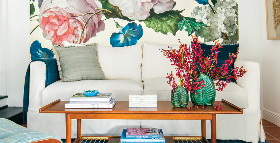
The lively pattern on the chairs is a nod to the client’s love of flowers–and it’s not the only one. Using a mural wallpaper of large blooms, Saliba created an accent wall in a small sitting room. “We call this space the saleta,” she says. “It’s where the owner enjoys reading and appreciating the garden view.” Here, the designer installed a second smaller gallery wall, introducing new artworks that complement pieces the client had displayed in her former home. On a rug atop the house’s original Mexican tile, an Eames lounge chair and ottoman Saliba re-covered in light blue plaid fabric and a durable white sofa offer cozy seating.


A thriving bougainvillea tree injects a vibrant fuchsia shade in the patio, where a Janus et Cie table and chairs rest on pavers by Madison Construction Group. La Casona Garden designed and installed the landscape.

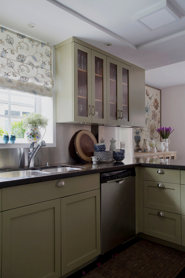
Florals reappear in a paper mural Saliba framed and hung on a wall next to the oval table in the breakfast room. They’re also seen on the embroidered fabric used for a window valance in the kitchen, where the designer kept the Ubatuba granite countertops andupdated the original cabinets by painting them olive green. These choices were made because the owner didn't want the new kitchen to look too modern, Saliba explains. The window valance was made with an embroidered fabric from Wall Boutique.


The Ubatuba Countertops and the cabinets were kept because the owner was afraid a new kitchen would look too modern," Saliba explains, adding that the cabinets were originally a cherry hue. The window valance was made with an embroidered fabric from Wall Boutique.


But real flowers are found in the patio, where an alluring bougainvillea tree dominates. Saliba transformed the lush space into a casual social area by surrounding a rectangular outdoor table with wicker chairs topped by pillows in a botanical textile. “The idea was to create an area where friends could gather to have meals and celebrate,” she says.


Architect and general contractor Carlos Figueroa created a covered loggia furnished with wicker peacock chairs and a Serena & Lily garden stool on concrete-cement flooring. The cushions on the chairs and the built-in bench--designed to offer more seating without blocking the garden view--are from Wall Boutique.

Views of the outdoors can be enjoyed from each of the bedrooms, all equally lovely respites embellished with sheer draperies, white walls, wooden beds and nightstands. Soft hues impart serenity, and strategically placed artwork reintroduces a collected feel. It’s all reflective of the owner, whose style shines through each space. “The house is very her–it has her fingerprints,” Saliba says. “There is personality here.”


1,224 views0 comments
Doral Stones Logo
bottom of page